For me personally the last 6 months of the year I have changed my design direction around 180 degree’s for the better. I am no thoroughly enjoying the work which I ma producing and it excited me. Before this, I was not playing to me strengths so I was trying and failing in certain areas, such as type and layout. However I now feel fully confident in my own illustrative style to continue and push my experimentation with it further.
My portfolio shows a more broad spectrum of my design practice, and less of my illustrative style – this is because I have only now became fluent in it. However I think it clearly shows what makes me tick, the style, layouts and the media used, which is mixed media and photography. It shows a range of application which my style and way of working can be applied to, this is very effective as it shows the audience variety within my portfolio.
In the last 6 months I have used my initiative more started to do much more primary research into contemporary designers. I think the turning point was when I was in London over February time and I saw a same sample of Mike Perry’s work in a small gallery in Soho. I subsequently now have a huge interest in hand rendered typefaces, and I would now like to combine illustration with them like Kate Moross work.
Similar artists who I have found who helped me become confident in my illustrative style were martin hake and sally Faulkner. They both used mixed media collages hand cut out to make there illustrations – so I have tried to combine both of there skills within my work, especially for the dove brief.
However if I want to extend my practice and produce hand rendered pieces like Moross, these will not come easy to me. It will take time and careful playing where yeah section of text will go and I have found this year that I do have a tendency to over complicate pieces. This will be a big challenge however I love her work and style so combing hand render text with my illocutions will be the next focal point.
I would also like experimenting much more with colour and making my pieces more vibrant and exciting. Again before now I haven’t really been bold or brave when using colour, sticking to the minimum choices. So next year and over this summer I was to start this and play around.
Things to take further and push myself harder for are research skills and experimentation skills. To achieve the best possible solution and allow for mistakes when experimenting and producing the final product, I am going to have to start my research earlier and become much more thorough -visiting galleries for primary sources, questionnaires etc as this year I had too much secondary sources research.
My proposed dissertation title is the history of celebrity endorsements in branding and advertising. This is a topic, which interests me, in understanding peoples desire and fascination with the celebrity lifestyle, I find it quiet humorous and humorous and sarcasm is a common theme within my work. However in relation to my design practice it could lead to possibly mockery adverts and fake celebrity branding.
Wednesday, 10 June 2009
Monday, 1 June 2009
Design Practice Evaluation
1. What skills have you developed through this module and how effectively do you think you have applied them?
I feel like I have begun to establish my skills to my advantage and used them appropriately in these 3 briefs. I have developed my use of mixed media illustartion effectively in my opinion – cutting and sticking and colouring over and there arrangement placed together. In particularly for these briefs I have used a different style of mixed media, inspired by Marin Haake and Sally Faulkner. I painted a range of coloured backgrounds, and then used the various colours to make the object which I was making, cut out singularly by hand. I would not say I am the most patience of people, however I really enjoyed doing this despite it being hugely time consuming especially working on the Dove brief.
I did from the start plan ahead, working again to my advantage allowing me to know exactly what was expected at the end of each week and what projects were taking longer than I had initially thought. This really benefited me during the final week when I am normally in a state of panic, where as this time round I was calm and I new exactly on each day was left to do.
2. What approaches to/methods of research have you developed and how have they informed your design development process?
I think here thee is room for improvement. I feel that the Dove project research was very limited and I could have researched into the brand a lot more and recorded it. The questionnaire results taking form my brothers two class at Newham School in Bedford, I found shocking. These girls were 14 and 15 yet could already see so much wrong with themselves which was not true. It demonstrated clearly how the medias vision of a perfect body image is targeting and effective children younger and younger now.
However the gardening brief I think I researched well, helped with my mum being a keen gardener I had lots of resources here to gain information, though I could of done questionnaire to see what my target audience would want to find out exactly, (The 10 things you should know about). However I chose to see this title as subjective to what I thought people should know about gardening, so they were in my opinion the top ten things my audience should know starting up.
3. What strengths can you identify in your work and how have/will you capitalise on these?
I would consider the strengths within my work would be image illustration and now layout. I was not very used to image and large chunks of text combined producing a publication in the gardening brief, this is partly why I chose it to push me forward out of my comfort zone. I made it work for me, I tried to make the layout fin to read, and engaging to keep my audience interested and I personally think it has worked. I am very pleased with the overall final prototype.
This piece still involved a lot of hand rendered pieces cut out and scanned in, but also a lot of added vector work which again was something I was not confident or strong in. particularly the front covers I designed for the main publication and its two subcategories. I liked the simple style and I made them work for me and fit in with my hand rendered design style.
As I said above, I really enjoyed cutting out and sticking so I will take this new method of mixed media on board and defiantly use in again in future projects. I feel that this year I have created a bank of different methods which I enjoy doing and I could use in my projects.
My next step would be to combine my photography with my illustrative style, overlapping and playing around with there arrangement.
4. What weaknesses can you identify in your work and how will you address these more fully?
Allow more time for idea development. However this these briefs were al fairly short and snappy I would say that I have developed my ideas enough in the time I was given – but for future projects I should exploit my ideas more the get the best possibly outcomes.
On reflection I would also say that looking through my work it may not be clear to a viewer what is actually going on, why I have chosen designs which I have and not others as my design sheets are mainly packed full sheets and hard to pick out the relevant writing. I will in future projects make them clearer and simplistic to it is easier to see my design development and choices with reasoning.
My blog is appauling, and I have hardly touched it during these last 5 weeks. It is a huge let down and I NEED to get into the habit of sitting down a couple of times a week and doing it. It lets me down and a lot of extra research could be done on it.
5. Identify five things that you will do differently next time and what do you expect to gain from doing these?
1. Pick up my photography again, an combine it within my work, this will increase the range of mediums which I will be using.
2. Allow more time for design ideas to develop, exploiting my ideas to create the best potential results.
3. Present my ideas in a clear, concise format so they are easy to understand and easy to make the links and connections with my design desicisions.
4. Improve research skills, wider understanding of my audience and what they want.
5. Blog everyday to increase regular posts to inform others what exactly I am doing.
Attendance – 2
Punctuality – 4
Motivation – 4
Commitment – 4
Quanity of work produced – 3
Quality of work produced – 3
Contribution to the group - 3
Tuesday, 19 May 2009

Monday, 4 May 2009
Friday, 3 April 2009
End of Module evaluation
1. What skills have you developed through this module and how effectively do you think you have applied them?
I feel I have developed illustrative skills in a style, which I am comfortable in using. I used to initially work with a thick stroke nib pen, but I have found the thinner nib I use, the easier I find to draw. So one some of the later ‘Femme” illustrations I used a 01mm pen to draw them and I found I had much more control.
I have also learnt a lot form Lucy, and how she draws and develops her pieces. I found it very interested simply to watch her and see how she maps the parts of apiece together.
I had never previously used post it notes on selected pages to document, analyse and evaluate – but I found this approach very effective, simple and easy to record the change/development in ideas. I will take this method on in future projects.
2. What approaches to/methods of research have you developed and how have they informed your design development process?
I think together we have thoroughly researched our target audience – using a mixture of questionnaire and surveys and looking a popular fashion labels which our target audience consume daily. By looking into this aspect, it helped us focus on colour schemes, image and shape, which our consumers would like to see more of. I would of initially never of gone into so much depth if I was working on my own, and I don’t think Lucy would of either – so we fed of one another in a positive manner.
I will defiantly in projects to come try to consider all aspects which can be researched, and take the moto that there can never be too much reach into your target audience.
3. What strengths can you identify in your work and how have/will you capitalise on these?
Strengths within my work are layout and juxtaposed images together to make one piece. One of my main jobs with working with Lucy was the layouts of the Kleenex boxes and putting all the parts together onto the nets on the Macs and arranging them in a manner that they would all connect together and work when the box was constructed.
Overall I really enjoyed this, as I do not normally work with purely image and illustration, normally there is text somewhere within the piece and that is what I base the layout around. So it was challenge to visualise the completed box, but I think the designs work well together within each sets.
I am very please with the final context photos which I took, all the boxes look very well presented and blend into there environments which was the plan. They represent the boxes very well.
4. What weaknesses can you identify in your work and how will you address these more fully?
Exploit more ideas, with the time which we were given we could of trialled a good 4/5 different set designs and progressed with the interactive designs, which in the crits the majority of people seemed to really like.
So maybe develop more strict time management, in analysing what exactly needs to be done by the end of each week/day.
5. Identify five things that you will do differently next time and what do you expect to gain from doing these?
1.Plan ahead, produce tables and be efficient with our time.
2. Continue to develop my own style of illustration and become more confident and fluent.
3. Exploit more ideas in the time given, and cover a broader range of different medias – more experimental designs as a result.
4. Document the making with more use of photography – improve developmental work.
5. Blog everyday to increase regular posts to inform others what exactly I am doing, instead of leaving it to the last minuet.
Attendance – 3
Punctuality – 4
Motivation – 4
Commitment – 4
Quanity of work produced – 3
Quality of work produced – 3
Contribution to the group - 3
Tuesday, 31 March 2009

Sample of Box net


These are some of the intaial designs which we produced for our first crit with John. The deisgns went down very well, and all girls present in the crit adored them. John simiply encoraged use to take these designs fruther and push ourselves and experiement more. Maybe consider sets of designs?

At the crit I also showed the cut out stencil interactive Kleenex box which I made with the seaside scene. This deign was totaly diffrent from the ones which we have now produced, however John and more of the boys seemed to really like it.
Please see paper work for more development for the cut out idea.
Possibale Designs


The illistartions in which we chose to deisgn we wanted them to keep up the femmine and fashionable theme. So we chose girly items of clothing such as underwear, dressing tables, make up, and decerative homeware pieces which girls would find appealing.
Here are some example of these illistartions scanned in and arranged and altered to fit against the background which I made. I varied the size, scale and colouring of some of the illistartions to experiment wiht there layout and overall aesthtics of the box.
It was discussed though, that the designs look much better if the background was simple and did not contain much illistartion itself - to not over complicate the final piece.
Backing Designs
I was experimenting with a similar watercolour/pastel shade approach to be the backgrounds of the Kleenex boxes.
I experimented using paint and colouring pencils to illustrate over these to make them more interesting, as if they could be used as the box designs on there own without adding any more to them. I wanted to use brighter, more vibrant colours to catch our audiences eyes and make them diff rent/move them apart form the average tissue box colours.


I experimented using paint and colouring pencils to illustrate over these to make them more interesting, as if they could be used as the box designs on there own without adding any more to them. I wanted to use brighter, more vibrant colours to catch our audiences eyes and make them diff rent/move them apart form the average tissue box colours.


Tin head, aka Chris Wright
I have always been a huge fan of his work. his style is very similar to mine, a mish mash of diffrent medias and techninques layed out and presented in a pleasing way. I have huge inspiration for this guy, he is only 21 years old and is still a student studying down in brighton.


Illistartion inspirtaion
We began looking to at other designers for inspiration for illustration and integral ideas, for example Rob Ryan and Luke Best. Looking at colour ways and use of media and how we could incorporate them within our designs.

Luke Best's work I adore, I love his cut and stick approach of block colours in block shapes. Then the use of mix media with shading in between. his work appears very simplistic, yet obviously a lot of thought and consideration has gone into his layout and what exactly he is trying to communicate.


Luke Best's work I adore, I love his cut and stick approach of block colours in block shapes. Then the use of mix media with shading in between. his work appears very simplistic, yet obviously a lot of thought and consideration has gone into his layout and what exactly he is trying to communicate.


Fashion Design


Topshop deisgn & urban outfitter clothing design. Funky colours and bright, bold, dynamic style.
Homeware designs
We want our box designs to be modern and reflective of their stylish homeware and surroundings to represent the people who are buying them. We Researched into the homeware sections of the most fashinable, upbeat stores on our high streets, inparticular Urban Outfiters, habitat and Topshop as hese stores are known for there desirable, kitsh fashionable homeware designs and use of colours.


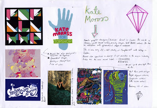 Both Kate Moross & Daisy De Villeneuve both have been comminsoned by Topshop to design clothing and these have subsequently used as bag designs and shoe box designs.


 Both Kate Moross & Daisy De Villeneuve both have been comminsoned by Topshop to design clothing and these have subsequently used as bag designs and shoe box designs.
Wednesday, 18 March 2009
Finalizing our audience and aims
We chose to limit our audience down to primiarily females aged 16-24. Our aims are listed below:

We spoke to Lorenzo and he gave his responses and gave us diffrent ideas to focus on and other ideas to consider:


We spoke to Lorenzo and he gave his responses and gave us diffrent ideas to focus on and other ideas to consider:

Kleenex Pocket Packs
Pocket pack designs, particular attention to the cute disney packs - very nicely packaged for any child to beg there mother for. the other pack designs are obviosuly for an older target audience, and again like the box designs do not grab me, there no appealing in the slightest.
However this could be because they are for such a broad age range that they cannot be daring with the deisgns incase to put people off. Luckily for us, we have chossen to specialze within the target audeince of 16-24 year old females.


However this could be because they are for such a broad age range that they cannot be daring with the deisgns incase to put people off. Luckily for us, we have chossen to specialze within the target audeince of 16-24 year old females.


Kleenex Past Advertisements
Looking at Kleenex's 'Let it out' campaign and their advertisements and how they have approach them:
The modern day adverts use humour more to attract their audiences.
The modern day adverts use humour more to attract their audiences.
Thursday, 12 March 2009
Sniff tissues
I used to try and collect these packs of tissues when I was 14, I absolutely loved them and then become a craze at my middle school, rather sad! This is a company founded in American called SNIFF tissues. There designs are simplistic, yet fashionable, funky and desirable with there use of colour and imagery.Much more appealing for the target audience which Kleenex are trying to reach out too.


Kleenex current packaging designs
I was a bit shocked to find that Kleenex's best seller was this green sheep box (picture below) from there collection 'Let it all out'. To me is was not inspiring or appealing and a very simple design and does not represent Kleenex's brand. The sheep look cartoon/clip art features - nothing which Kleenex has really used before in past designs. To me, they look out of place, however these are still the most popular designs in the UK to date.


All of the other designs which we found seemed to simply focus on floral patterns, pastal shades and white being the backing colour. Not very exciting!


All of the other designs which we found seemed to simply focus on floral patterns, pastal shades and white being the backing colour. Not very exciting!
Initial Kleenex research
After choosing the Kleenex repacking brief we started to brainstorm rapidly, marking out and considering all what Kleenex were asking us to do. Here are some of our initial brainstorms and ideas sheets considering our audiences and Kleenex as a brand:


We looked into all the products available from Kleenex from their UK website, all are listed above. There list of products was much more limited compared to there range in the US we found, above is an analysis of all the products functions and box details.


We looked into all the products available from Kleenex from their UK website, all are listed above. There list of products was much more limited compared to there range in the US we found, above is an analysis of all the products functions and box details.


My creative partner
After advertising myself with all the qualities which i think i possess, i paired up with someone. I would put my advertisement and wanted posters up on my blog, but I find them appalling.
We finalized on taking the Kleenex Re-Packaging brief forward.
I wanted to gain illustrative practice with this brief, and work solely focusing on image and illustration alone. It would allow me to direct my time into something purely image based, not involving type at all which ws something I have not done at all since I have started this course.
I choose to work with Lucy Hawkins, I think we compliment each other well with our working styles. Shes is a very competent illustrator with a style perfect for this brief - very femmine, cute, girly illustrations & and my style with the use of mixed media approach/ more hands on and working with layout and overall presentation.

Subscribe to:
Comments (Atom)